I was meant to post this in April, but life distracted me from the vast space internet can be and I forgot about it. Today, after a well-deserved celebration and a small earthquake, I had an epiphany and the post is finally here.
When you’re working on essays, thesis, homeworks, research, among others, you can stumble with different websites. Internet can be a double-edge sword, the trick is knowing how to use it, and when to stop. Here are a few websites that can be your friends.
There are many others websites to look into for information, but at the end of the day, we all choose the ones we, first, understand, and second, have what we need.
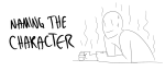
When writing, it’s
important that everything you include serves a purpose. The character’s name, their
favorite color, and their choice of companion give an impression about the character,
the world around them, and the past that shaped who they are. The more you amplify
these elements, the greater the image you’re painting for the reader.
For example, say the plot
calls for the character to buy a car, and they choose a blue one. “Blue” is a
necessary detail to include in the narrative, but by giving this specific
decision meaning, you make it important. Perhaps blue was their parent’s
favorite color, and they strive to please them. Perhaps blue is a calming
color, and it reflects their calm personality. This makes the narrative richer.
In the same way, characters
need clothing, so why not make it a useful element in the story? Take advantage
of this opportunity to tell the reader something. Here are three things your character’s
choice of clothing can amplify in the story.
It Says Something About Their Personality: The way a character dresses
can reflect their tastes, views, and emotions. For example, your boisterous
character might be best dressed in colorful shorty shorts to reflect her free
spirit. Her sass and disregard for other’s opinions is what tells us her
personality, but this small addition has made the fact visual as well as mental.
In another case, your reserved and slightly distrustful character might be
better dressed in a bulky designer coat; this reflects on his desire to be
enclosed but also regarded as superior. Your character’s personality is
independent, but the proper clothing can complement and amplify their unique views.
It Says Something About The Setting: Dressing your characters in
clothing that reflects their setting will reinforce this new atmosphere in the
reader’s mind. Colors give impressions all on their own; dark colors such as
greys or blacks will match the dark atmospheres. If you’re trying to show a
contrast between two groups – one more successful and the other starving – dressing
one group in bright pinks or yellows will give a sense of light and energy, making
them seem healthier. The style also reflects the world; conservative dress such
as long sleeves or coats can reflect order or oppression, while less conservative
clothing can show rebellion and freedom. Your world itself will determine the
setting, but clothing can complement it, amplifying the atmosphere.
It Can Say Something About Them Physically: In addition to symbolism,
clothing can serve a literal purpose. If you have a young character, dressing
them in outfits which are colorful and airy can complement their younger
attitudes. If you have a character with an embarrassing scar or injury they
wish to hide, constantly dressing them in long sleeves, despite weather, can
subtly reveal this. These details can amplify the characters themselves but
also open new doors for foreshadowing.
Every detail included in
your piece of fiction should serve a purpose, and perhaps even tell a story
within a story. Minor details such as a character’s style, their choice of
design, or their choice of color can breathe new life into the details of your
narrative.
Over the course of the next
few weeks, I’ll post different character clothing options as inspiration, and detail
how each item could be an asset to your story. Hopefully this will stir up some
creative juices and help you make choices to apply to your cast.
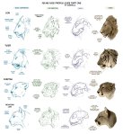
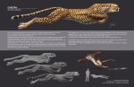
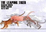
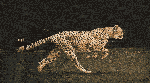
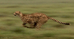
Please note that in the first cheetah GIF, the head has been insolated. When running, the head will bob up and down slightly. Not a lot, but just know how the head attaches to the neck and how that moves when the body is oscillating up and down when they run, like in the second GIF.
For those wondering about HOW to do this, here’s a short explanation according to me:
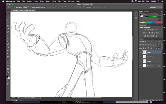
Drawing A to Drawing B: -the most obvious change is the exaggeration of the line of motion in the character.
In Drawing B the line of motion is much more pronounced, creating more drama and movement to the whole composition
-The arms are open wider, showing more confidence and exuberance in the character, exaggerating their emotions so they can be more clearly read without having to look to the face for emotional cues.
-the legs are wider apart, adding to the aforementioned confidence but also giving the character a solid foundation, visually speaking.
-The head is tilted back and overlapped by the chest, adding a touch of dynamic perspective to the drawing.
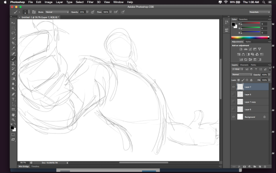
Drawing B to Drawing C: -Most obvious change is to zoom in on the character. Character framing is just as important as what the character is doing. Zooming in can help infensify emotions. this shot is ALL about this character and what they’re feeling. -Because of the zooming in, the arms/hands would have gotten lost, so instead of making the canvas wider, the artist has elected to rotate the character slightly, bringing a dynamic angle to things and more intensity to the close shot. -While the character is more upright in this shot compared to Drawing B, in Drawing C the chest still slightly overlaps the neck, preserving the feeling of being slightly below the character (putting them in a position of power relative to the viewer), which helps maintain confidence and power in the character. -the chest is exaggerated to carry the majority of the body’s line of action so even though you cannot see the legs, our brains are able to fill in the gap and envision that line of action. -The cropping/framing of the character allows for a more interesting composition/negative shapes created by the positive (character) on the negative (background), creating more visual interest as well as a circular motion to the composition through the arms, across the face to the negative space for the eyes to rest in before dropping to the hand in the background and back through the composition again.
DID YOU DISSECT MY DRAWING TO FIND OUT WHY IT WORKS?? I LOVE YOU. I LOVE YOU. THANK YOU SO MUCH


