1. Draw the most common appearance for your character. This is your comfort zone. (Color)
2. Draw your character from the front, the side, and the back. This is something called a ‘turn sheet’. It’s a little boring to do, but will be very helpful to you in the future to have on hand.
3. Draw your character from the front, the side, and the back, but have them in nothing but their undies at most. This is to show off how your character is built. Drawing nothing but a straight pant-leg with no structure under it is no way to learn! (Skip this if your character doesn’t wear clothes)
4. Draw your character at three different ages than they currently are. (Must be noticeably different. No ages: 4, 5, and 6, etc.) Color one of them.
5. BANG! Your character just heard a loud noise right behind them. Draw their reaction!
6. Draw a bird’s eye view of your character.
7. Draw your character feeling very happy. Show body language.
8. Draw your character feeling very angry. Ditto.
9. Draw your character feeling very sad. You know the drill.
10. Draw your character with a different body type than they usually have. This helps you map distinguishing features onto different ‘templates’.
11. Draw your character if they were the opposite gender.
12. Draw your character as a different species than they normally are.
13. Somebody has just handed your character a live duck. Draw their reaction. Keep them in character.
14. Mary Sue the HELL out of your character. (Due to being asked “What is Mary Sue?” several times, I have included a link to the evil that is Sue: [Click if you dare.]
15. Draw your character lifting something heavy. (no magic allowed!)
16. Draw your character in an opposite role than they appear in your story/continuity.
17. Draw your character doing something they enjoy.
18. Draw your character doing something they do NOT enjoy.
19. Draw your character in a dynamic pose that is not a profile shot (from the side).
20. Draw the most common appearance for your character. Color it. (Pssst! See if it improved from the first one you drew. I bet it did!)
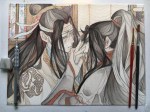
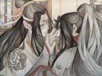
A rough translation I made of a side story where Jin Ling, Lan Sizhui and Lan Jingyi solves a mystery with Wei Wuxian teaching them along the way. The description of this chapter was “Lao-zu’s educational class about night hunting”. This story happened after the ending in the main story, so there are some spoilers.
Since I’m not very good at writing, some parts will probably sound not very fluent and there might be small mistakes x__x I was thinking about whether to share this with only friends, or to actually post it.. Then thought people might be interested and decided to share it haha. Please click “keep reading” to see the translation.
I’ve been getting quite a few asks about the process for the patterns in my stylized artworks, so I decided to put together a couple of tips regarding them.
Firstly, what you need are
— CUSTOM BRUSHES —
Most of the patterns I use are custom brushes I made, such as those:
For the longest time I was convinced making brushes must be super extra complicated. I was super extra wrong. All you need to start is a transparent canvas (2500px x 2500px max):
This will be your brush tip. When you’re satisfied how it looks, click Ctrl+A to select the whole canvas and go to ‘define brush preset’ under the edit menu
You will be asked to name your new glorious creation. Choose something that describes it well, so you can easily find it between all the ‘asfsfgdgd’ brushes you’ve created to be only used once
This is it. Look at it, you have just created a photoshop brush. First time i did I felt like I was cheated my whole life. IT’S SO EASY WHY HASN’T ANYONE TOLD ME
Time to edit the Good Boi to be more random, so it can be used as a Cool Fancy Pattern. Go into brush settings and change whatever you’d like. Here’s a list of what I do for patterns:
– under Shape Dynamics, I increase Size Jitter and Angle jitter by 5%-15%
– under Brush Tip Shape, I increase spacing by a shitload. Sometimes it’s like 150%, the point is to get the initial brush tip we painted to be visible.
– If I want it to look random and noisy, I enable the Dual Brush option, which acts like another brush was put on top of the one we’ve created. You can adjust all of the Dual Brush options (Size, Spacing, Scatter, Count) as you wish to get a very nice random brush to smear on your backgrounds
The result is as above. You can follow the same steps to create whatever brush you need: evenly spaced dots that look like you painted them by hand, geometric pattern to fill the background, a line of perfectly drawn XDs and so on.
BUT WAIT, THERE’S MORE
— PATHS —
But what if you want to get lots of circles made of tiny dots? Or you need rows of triangles for your cool background? Photoshop can do all of that for you, thanks to the magic of paths.
Typically, paths window can be found right next to Layers:
Draw whatever path you want, the Shape Tool has quite a bit of options. Remember, paths are completely different from brush strokes and they won’t show up in the navigator. To move a path around, click A to enable path selection tool. You can use Ctrl+T to transform it, and if you move a path while pressing Alt it will be duplicated.
Now, pick a brush you wish really was in place of that path you’ve drawn and go to layers, then choose the layer you want it to be drawn on. Then, click this tiny circle under the Paths window:
Then witness the magic of photoshop doing the drawing for you while you wonder how tf have you managed to forget about this option for the past 2 years
You can combine special brushes and paths for all sorts of cool effects. I mostly use them in backgrounds for my cards, but you can do whatever you want with them.
I hope that answers the questions for all of the people who were sending me inquires about the patterns. If you have any questions regarding this or any other Photoshop matter feel free to message me, I’m always up for complaining about how great and terrible Photoshop is C’:
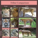
Ounce is the traditional name for the snow leopard. Although not really in common use anymore it is still an acceptable alternative name for the species.
I assume since “snow leopard” wouldn’t have fitted into the space it made sense for the person who made it to use ounce instead.
“if fear of failure is keeping you from drawing, deliberately draw the stupidest, shittiest ideas you can think of so you’ll get practice in without disappointing yourself” is like, unbelievably helpful advice.
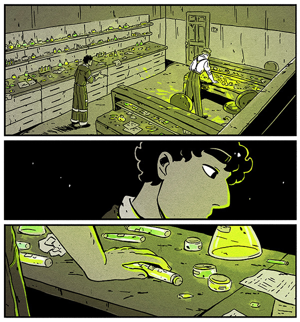
I’m by no means an expert on drawing comic environments, but I’ve been using a few specific methods to get them done which I’d like to share! These tips did pretty well on Twitter so I figured I might share them on Tumblr as well [example panels from my webcomic Shaderunners]:
First, if you’re drawing backgrounds while using straight lines/a ruler and you’re struggling with your environments looking stiff, FREEHAND! It makes everything looks more natural, even if it’s not technically always “accurate”. Here’s a comparison (old/recent):
In general environments look more real the more “imperfect” they are, This isn’t a hard and fast rule of course, and I’m sure there’s cases where a stiff quality is HELPFUL to your story – so I think being aware of the difference in effect is key!
Second, for environments there’s a little trick I like to use, and this kinda depends on your style and how rough the place you’re drawing is, but I like to add little marks and dirt to the walls, the floor, everything. It makes things feel more real/lived in.
Third, get SketchUp or a similar 3D modeling software. Drawing a comic is hard work and if you’re doing it alone some shortcuts will have to be taken – that is NOT to say that it’s cheating if you take them. It’s simply helpful.
A thing I never see talked about is how 3D modeling is a SKILL, not a magic hack. I had to get BETTER at creating environments in SketchUp and incorporating them into the comic organically. Here’s an example of an old background done with the help of SketchUp above a recent one:
There’s No Need To Colour Everything. See how in the first pic below I coloured (er, you know) every object on the shelves? Waste of time – if anything it takes away focus from the characters. Nowadays when things are small, faraway or unimportant I let them blend into the background.
Similarly, in crowd scenes I used to draw every single person and detail, thinking that it would look impressive. The result was spending hours on a panel readers would look at for two seconds. Plus, after all that work it didn’t actually end up looking like that big a crowd.
Compare that to crowd scenes I draw now – by no means perfect but I feel that leaving out details in the faraway figures makes the scene look fuller; it leaves room for the reader’s mind to fill in the gaps and imagine the crowd being bigger than is shown.
And uhh that’s it? Basically this advice is mostly little tips that can be helpful, rather than a guideline/rule. Environments in comics (to me at least) are an efficiency game, and I’m constantly thinking of ways to be economical when I work on them while also having fun!
Hopefully this was helpful to someone out there, and if you were intrigued by these panels you should check out my webcomic at @shaderunnerscomic!