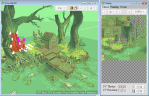
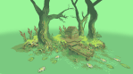
Sorry this has like.. nothing to do with color palettes, but I found this 3D program really neat :0! If you are Very Bad at UV mapping like i am but wanna make cute low poly things, this looks pretty easy to use! I believe the creator is giving out free keys on their forums.
Crocotile Site (also, the name is a pun! even more ideal tbh!)
I don’t use SAI to paint so I don’t really have settings as such – sorry! – but I’ll leave a link below to the brush pack that I use on CSP.
What I do is line-art, cell shading and before I paint over that I like to set a multiply layer of bright yellow/orange on a lowish opacity over the cell colours. It tends to make colours warmer and more saturated, and combined with bright blue/purple on a second multiply layer for the shadows, it makes the picture pop!
Line-art/sketches don’t have to look great as long as they’re clean and have clear shadows and colour control. I pretty much just add a bunch of multiply layers to the cell colours and just paint straight from that. Don’t feel too locked into the original sketch! I just paint straight on top of everything.
The main brush I use to paint with is the flat brush from this wonderful brush pack by MagdaPROski on deviantart – I also use the hairy brush from it for line art. If you don’t have CSP then I totally recommend that you get it, it’s easily on par with photoshop when it comes to digital painting!
Sorry it took me a while to reply to this! I like to ramble and I went into more detail than I thought I would. Hope this helped anyway!
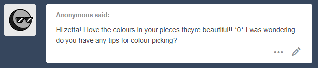
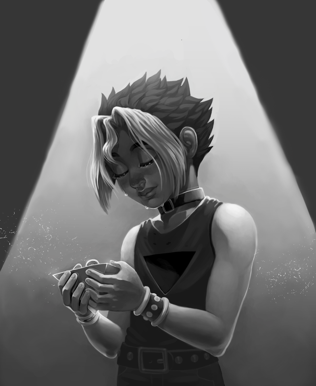
Hello!! Thank you so much!! ‘v’ I’m no expert at picking colors but I’ll try my best to explain some of my thought process.
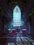
For me, one of the most important parts is establishing the color and lighting in a scene before I even think about picking colors for the characters ^^ I find it much easier to pick colors for a character once I already have some kind of background color or scene since it means I just need to grab colors that look like they “fit in” that scene, instead of taking a wild guess.
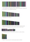
It’s really important to me that I maintain a cohesive feeling in the piece, and this is easiest to do when I do that from the very start. It’s up to you how you want to do this (if you want to do this at all!) – for me, I have a tendency to choose initial colors that are more desaturated so they don’t clash too much. As I move forward in the piece, I’ll end up adding more saturated and contrasting colors.
A lot of these colors seem wayyy different from what the “actual” color of something is. It’s important to understand this distinction! Just because a particular color is, e.g. dark and desaturated by itself, doesn’t mean it will necessarily appear that way when presented against other dark and desaturated colors. Relative color is pretty amazing!
One last thing I like to do when I’m doing lights or shadows for a single object is that I won’t just pick colors that are simply lighter or darker – I’ll usually move along the color wheel and pick different hues as well. You can do like warm light / cool shadows, or cool light / warm shadows with this. This kind of contrast makes the piece a little more interesting to look at.
(i tend to default towards warm light / cool shadows by picking lighter colors of a hue closer to yellow, and darker colors of a hue closer to blue/purple. you should feel free to mix it up!!!)
Outside of all that, references are your friend! There’s a lot to be gained from photographs and other people’s artworks. I almost always throw together like 40 pictures to use as reference as I’m planning or painting something. So long as you’re not copying their color schemes exactly, don’t be afraid to use references!!
This ended up being quite long, but I hope this could be somewhat helpful! Good luck anon!!
If you ever wanted to know how to properly do a 2d character turn, my friend max and I made a video showing you how to use the photoshop timeline to create a rotation of your characters. this can be applied to almost any type of character design. you can watch the full video here on our youtube page.
thank u thank u !! i love trans atem so much too ?? tbh i draw him according to how im feeling abt my gender at the time bc it helps me feel okay w/ myself :’)) im glad he helps u too !!