This was a request and at first I wasn’t sure if I had anything to provide with, but as it turn out it got a little longer than I expected because there were actually things I had to say!! Wow!!
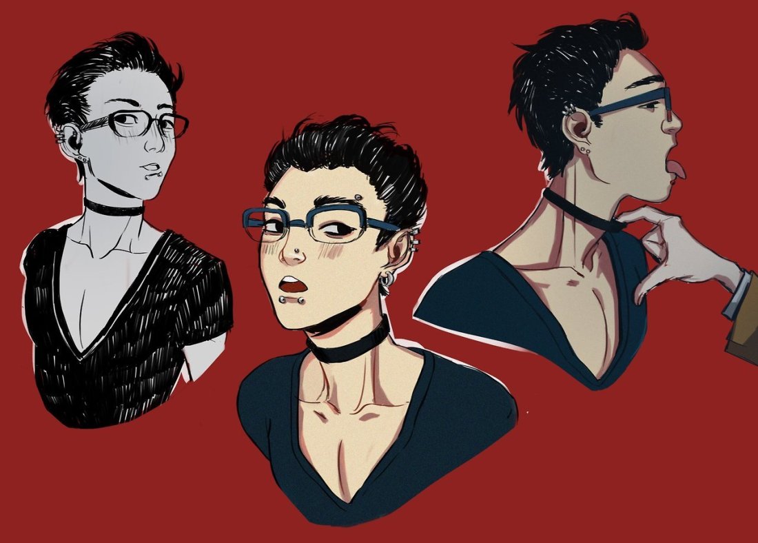
Anyway, this is some guidelines I follow when I try to make the face expressfull, more specifically the mouth! It is often neglected, since it’s actually pretty hard, I’ll admit. But I’m here to help (hopefully…)! A mouth expression tutorial as per request. Enjoy and hopefully it will help some a little. ʕ•ᴥ•ʔ
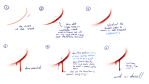
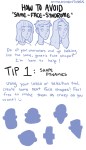
Draw the teeth at the right angle.
This is super important. The upper jaw follows the angle of the head, and the lower jaw will depend on how open it is. Make sure you have a rough estimate of where the teeth are, and how much of them you’re going to see!
The lips will VERY roughly follow the same angle as the teeth. It really depends on the character, but it gives you a sense at least.
If you DON’T do this, you’re going to lose so much volume and the mouth is going to end up looking unrelatable. I showed this example in this tutorial:
It’s not just the lips!
The cheeks, chin, and tongue play a role too!
Try look at your own mouth or references! I have a very pliable and large mouth, so that’s one reason why my characters have it too lmao.
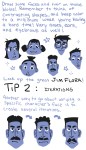
ASYMMETRYYYYY (ง ͠° ͟ل͜ ͡°)ง
I cannot emphasize how important asymmetry is when drawing expressions. It applies not only to the eyebrows to achieve the Dreamwork Face™, but also the mouth. Seriously if you draw a symmetric mouth I will deliver myself to your mailbox and then shout at you until you fix it.
Look at the difference between these two for example: which one has more “life”?
I think you get the idea.
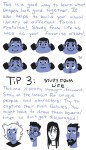
Push and squish – give it flow
Here’s an old drawing I have but it illustrates how I think when I squish the mouth, and use folding and wrinkles to my advantage.
Look at your own face and see where skin bundles up, where it creases the most and when bumps appear on your chin. Subtle details makes all the difference!
One VERY effective detail is illustrated in the first sketch, where I pull upwards on one side, and downwards on the other. That’s a good detail to use when the character is making a skewed expression, or is extremely frustrated. I encourage you to play around with that concept bc it’s ~super effective~!
EXAMPLES:
Happy: Your entire mouth is pushed upwards, not just the corners of your mouth!
I tend to draw a :3 mouth bc I’ve been drawing Lance too much….. You don’t have to but it’s basically imprinted in my motor memory by now.
Pouting/frowning: corners are pushed down, middle pushed slightly up. Sometimes, there’s a slight dip in the middle too. It can give a sense that the character is biting their lips.
Showing frustration/intimidating/is intimidated: basically showing a lot of teeth. The corners are as open as possible and the middle sorta more squished. An extremely important detail here is showing some of the gums, and open space between the cheeks and teeth. That way it looks like the mouth it open to it’s full potential. Here is also where you basically MUST add folds and bumps, or else it’s not going to look relatable.
(Here I am again with the pulling upwards on one side and downwards on the other, as illustrated on the last sketch)
And then again, here’s just another doodle showing how important it is to show the gums. It’s the same face twice, but the second one looks slightly more frustrated doesn’t it?
As you can see, this last one is very versatile and I draw it a lot. Play around with the basic shape and see how much subtle details makes a lot of difference!
That’s it!
I hope that cleared some things up and was somewhat helpful! Enjoy drawing ✨
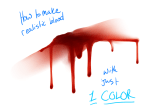
This is on my nsfw blog cause it’s based on this camboy!yuuri fic (which is amazing and really smutty). (oh and also it’s ABO just to like give you a heads up).
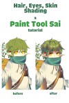
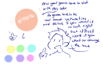
Ahhh thank you again//// im kinda flattered you would ask me for tips;;;;; Well colouring is really VERSATILE and so many possibilities!!! So there’s no right or wrong way to colour//// Here is just some stuff on how I colour, hope it helps!!!
I learned this tutorial from Youtube a long while back. You won’t have to restart your computer, but you need to save your drawings and restart the program you’re using.
Step 1) Go to My Computer/This PC (or any other variation) and right click
Step 2) Click on Manage
Step 3) You should get access to this menu. Double click “Services and Applications”
Step 4) Double click “Services”
Step 5) You should get a long list of all these manageable functions. Scroll down until you find “Wacom Professional Service”. Right click it
Step 6) You can either click “Restart” or press “Stop/Start“ manually
Now it should refresh and return things back to normal, and once you open up your program again pressure sensitivity should be back~! Hope it helped! (Also if you are curious, I use the Intuos Pent and Touch small)
Heyo! I got asked if I could make a tutorial on digital painting so I’m gonna throw together some advice meant for people who are starting out and want to figure out exactly how this stuff all works. Because it’s hard! What I hope to accomplish here is to make painting more approachable for you.
For those of you who don’t wanna bother reading that, here are the main points:
1. Learn your program and its tools, from brush properties to layer styles. And I mean learn them. Make a cheatsheet that shows you exactly what each button and scale does, both in isolation and in conjunction with other buttons and scales. Refer to this as much as possible until it is intuitive. The end goal is to know exactly what to do to your brush’s settings to achieve a given effect.
2. It’s perfectly okay to use your sketches, linearts, and other forms of line in your paintings. They can help guide the form and there’s no need to make something fully “lineless”! I never make things “lineless.”
3. Study other people’s art and try to think how they could have possibly achieved the effects they did. You can learn a lot just by observing and mentally recreating the process stroke by stroke—muscle memory is a powerful tool at your disposal. This becomes easier to do once you’ve started doing item 1 above.
OKAY!
So where the heck do you even begin?
What I’m gonna do is try to make digital painting as approachable as possible for someone who’s never really done it. The main idea here is that digital painting is just like real painting. So if you’ve ever done real painting, you already kinda know what’s coming.
I’m gonna assume you know the basics of digital art: you can sketch, line those sketches using layers and opacity changes, and fill the lines with color, maybe even opting to add some shading…and you’ll get something like this:
You know, cell-shaded, or maybe the shading’s blended, but you’ve still obviously a line drawing with color put down on layers beneath the lines.
The next intuitive step is to try going “lineless”…but when you remove the lines you get this:
idk about you but I’m laughing at how stupid this looks
When I was first teaching myself to paint digitally, I didn’t really know how to deal with this. Without lines, the form of the subject vanished or became a mess like the above. Even if I was meticulous and careful about placing down the color such that without the lines layer turned on, the shapes fit together, it didn’t look quite right. There’d be gaps, I wouldn’t know how to incorporate the subject into a background, the contrast wouldn’t be high enough, or it’d just in general look too much like a screenshot from Super Mario 64.
Painting requires a different process than the above. You’ll have to let go of some of your habits and conventions. Such as staying in the lines. Such as fully relying on the lines. Like, I love my lines, I love my sketches—but in painting, they are guides for form, and are not the form itself. So let me go through how I approach a given painting:
My painting process starts with a sketch (here a boring portrait for demonstrative purposes). I make the opacity of the sketch layer something like 30%, and then throw down my base colors on a new layer underneath. I’m not being meticulous about the sketch itself, because again it’s just meant to guide my placement of color. I’m also not meticulous about my placement of the color.
We’re essentially sketching with color. Because ultimately what we want is for the color to take on the form and shapes conveyed by the sketch.
There’s a lot going into this about how to use value, how to shade, how to use color, etc. that I’m kinda skipping over because it takes a lot of time to explain…but there are hundreds of tutorials out there on those topics so please, google around! I found some helpful tuts that way when I was starting out.
Something I find v useful is to keep selecting colors that already exist in your image for shading and hue adjustment. This is why I start with really blendy, low-opacity brushes when throwing down color on top of the background. I can then select colors within there that are a mix of the two.
For instance, I’ll select the color of the lines here:
…and use that to shade:
And maybe I’ll select one of the darker shades around his eye, but not the darkest, to make the shading a smoother gradient…and so on.
What I do in general at this point is go over the shapes and lines of the sketch. Such that I can turn off the sketch layer and see this:
I’m replacing the lines with shading and value. I’ll continue to do this as I keep adding color.
This is all super loose. I am not dedicated to any particular stroke. I just want the colors and shading and light source to be right. I’ll use overlay layers to boost contrast or add a hue.
Here are other examples where I used this process:
I am constantly changing brushes and brush settings as I paint. It really depends on what effect I want where. I am also constantly selecting new colors and applying or blending those in. I don’t believe in having some uniformly applied base color and then shading with only one or two…that’s what I’d do if I was cell-shading like the first drawing I showed you here, but painting should be about messing with color and opacity and blending to make millions of hues!
Good rule of thumb: Hard, opaque brushes for applying color. Soft, dilute brushes for blending colors. Sometimes hard, dilute brushes can make some cool blending effects! I personally prefer harder edges on my shading so that’s a brush I use often.
This is getting a bit long so I’m gonna split it up into multiple parts, but really what I want you to get from this is:
1. learn the tools at your disposal until they are intuitive
2. sketch and line are guides for form, not the form itself
3. rather, hue and value will produce the form
And of course, practice makes perfect!!! Every drawing you make, every painting you make, will bring you one step closer to the artist you want to be, and thus every drawing and every painting, no matter what, is a success.