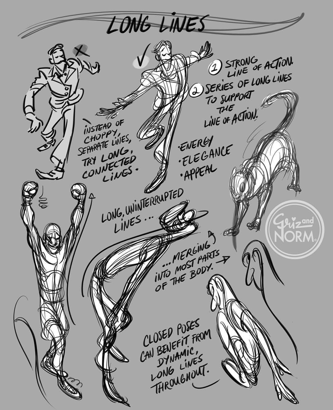
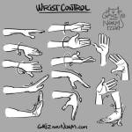
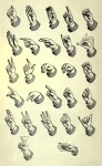
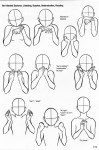
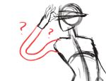
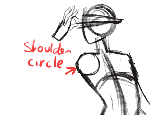
Tuesday Tips — Long Lines : one way to bring a pose “together” and simplify it in many ways, is to forgo the small choppy lines and go for long uninterrupted lines that move through the figure and connect its parts more seamlessly. Push strokes to their absolute limit instead of breaking it down too soon. You can always go back and make it more complicated if you like. Overall, long lines bring a kind of unity to most poses. -Norm @grizandnorm #tuesdaytips #100tuesdaytips #longlines #arttutorial #arttips
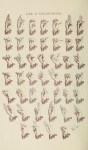
So down below we have a quick random page-sketch, if you ask me, it’s really easy to follow and here’s the fundamentals as to why:
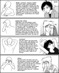
1: Comics are Theatre
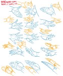
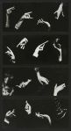
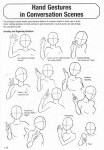
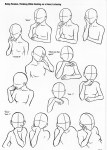
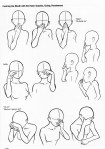
So a thing to remember that will put a zing on your comics is to have people do gestures, notice below how how the two characters are using their body language along with the second most expressive body part; The hands.
Reason why I say that people should remember Comics as Theatre is because on stage the actors had to do wide expressive motions with their bodies to convey to an audience that could be sitting far away on who is talking and what their mood is. ( this is why William Shatner is so expressive and all over the place during Star Trek. Because he was used to be on theatre.)
If you do notice in movies however, you can spot that the body language is kept subtle. This is because with movies you can get close to the actor and notice the changes in their faces and small things like fidgeting with their fingers to express restlessness…. in comics, this is super hard to express the latter and you could accidentally end up with just characters standing right up in a pose ( i see a lot of new comic artists trying to convey the subtleness of a movie into a comic, and it ends….pretty boring.)
TL;DR: try to express your characters like an actor of stage would! Don’t be shy and don’t let them be it either. You’ll have so fun, trust me.
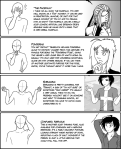
so a lot of people talk bout the 180, and I never got it at first til’ i began looking it up. Basically what it means is that two characters or a scenery should always be presented on being on the same side of the page (unless you had a middle panel showing the 90 degree turn of the subject/people.)
Notice how the two characters stay on the same side through the page but the left one. It will help the reader to know who is who, and thats A and B when making a comic!
TL;DR: Try to keep everything on the same side at all times unless you show a panel with a 90 degrees turn before going to 180. ==========================================================
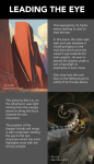
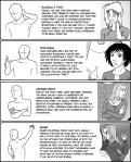
3: Ayo snake! you cute as hell
This one’s easy! Imagine a snake slithering over yo page ( it’s a nice snek) and you follow it with your eye. Make your reader follow the snakes path as well!
No but seriously; Try to always make panels and compositions so that they point to the next panel! Be it via speech-bubbles or characters or environment.
Notice how each panel literally guides you to the next. Character A looks to the right while character B looks down to the left, where her gaze hits the end of that panel which is compositioned to guide you down into the fourth panel, where char A almost points with her eyebrows and arms to the fifth ( which goes from top left to bottom right due to character B’s angle. Then just put speech-bubbles in the path and voila! The snake b slitherin’…wait…..Slytherin…oh…
Super easy but some forget; Remember to always have the smaller character be smaller than whats bigger than them. Don’t try to flip around and improvise sizes for the sake of trying to get an impact out of it ( unless they get further and further away). Oft it just messes the reader’s perception of size in the comic if you experiment too much and they get taken out of it early and will just end up reading text on pictures.
SO this was just some quick tips, hope yall try these tricks out the next time you make a comic c: cheers ❤


